It's been a busy September and I have been slacking in the blog department. I am going to do my best to get our classroom antics out there!


I always like to start the year off by exploring colour. In grade three we know about primary colours, so as a review, we make a poster, name them, and then create a "We All Belong" puzzle piece using inclusive words, designs of their choice, and only primary colours. It's a good inclusive piece that's easy to do during the first week of school and adds to our Promise bulletin board where we, as a class, came up with some guidelines for how we can work together as a team. For that activity, I brainstorm 5 topics, and post them on chart paper around the room. This year our topics were:
1. What should students in our class be doing to make sure our class is a great learning community this year?
2. What do you hope to learn this year?
3. What will YOU do in order to be successful this year in grade 3?
4. Our class should be ____________________ everyday.
5. School is important because _______________________.
Then I give the students markers and sticky notes and they add their comments to the chart paper under the apporpriate headings. Once we're all done, we look at all the answers and come up with a sentence that summarizes the points that came up the most.


My second art lesson still revolves around colour. We review our primary colours again, and this time make some predicitons. What will happen when we mix one colour with the next? After we have made our predictions, we experiement. Using glass jars, water and food colouring, we mix two drops of each colour at a time into the clear jars of water. The colour change is immediate, and exciting!
I've done in between lessons here in the past with straws and paint, allowing students to use the primary colours to mix into secondary colours by blowing the colour on to paper and having it mix and cross other colours.
Once we are confident with secondary colours, we talk about the colour wheel. We put the primary colours up, and then discuss placement of the secondary (green in between yellow and blue, orange in between red and yellow, and purple in between red and blue).
We then take a look at the wheel and make observations. Why are the colours in that order, what do you notice about the colours that our across from one another on the wheel? (They look like opposites, they are bright, they are Christmas colours -my favourite response). We talk about the position on the wheel and the opposite colour, and that these colours together cause the other to stand out. A great web resource to send this point home using real art is The Artists Toolkit. I use this site as a hook for many of my art lessons.
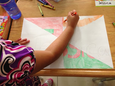
Once we have played around labelling complementary colours, we take a look at our assignment. Students are going to create a colour wheel using their names to show complementary colours. I have done this activity with a variety of ages, and no matter the sophistication of the student, I find explicit instruction, with steps necessary. We divided the paper into 6 equal parts using a ruler, and drew our name inside with bubble letters (drawing bubble letters was a lesson in itself. I tell them to write their names normally then trace around the lines and erase the inside). Then we decided where the colours need to go. For students who struggled with this concept, we coloured in the outside colours first, before the inside. Once they have coloured the outside colours, they use the opposite "complementary colour" on the inside.
Side lessons on colouring are important. We talk a lot about direction, pressure and saturation to ensure we are not scribbling and leaving white spaces.
Color Matters is a great website for all ages to explain colour and design elements.


No comments:
Post a Comment